
Typography Mistakes to Avoid in 2025
Typography mistakes in web design can undermine your site's quality. Learn how to avoid them and improve your user experience!
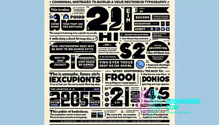
Typography mistakes in web design can negatively impact readability and user engagement; avoid issues such as poor font choices, lack of spacing, and low color contrast to enhance the overall user experience.
Are you aware of the typography mistakes in web design that might be holding your site back? It’s surprising how often these errors happen, and they can significantly impact your site’s success. Let’s dive into common pitfalls and how you can prevent them.
Understanding typography in web design
Understanding typography is essential for effective web design. Good typography enhances user experience and helps convey your message clearly. Typography includes font styles, sizes, spacing, and layout. Each element plays a critical role in how visitors perceive and interact with your site.
Importance of Font Selection
The fonts you choose should match your website’s purpose and tone. For example, a formal site might use serif fonts, while a modern site may prefer sans-serif styles. Always consider legibility and scalability, ensuring text is readable on various devices.
Font Size and Line Spacing
Choosing the right font size and line spacing enhances readability. For body text, a size between 16px and 20px is generally acceptable. Use line height about 1.5 times the font size to create enough space between lines, making content easier to read.
Color Contrast and Accessibility
Color contrast significantly affects readability. Ensure there is enough contrast between text and background colors. Tools like the WebAIM Contrast Checker can help evaluate your color choices, ensuring your content is accessible to all users, including those with visual impairments.
Consistent Typographic Hierarchy
Creating a consistent typographic hierarchy guides users through your content. Use headings, subheadings, and body text effectively to establish a visual flow. This helps users quickly find information and enhances overall engagement.
Responsive Typography
Responsive typography adjusts to different screen sizes. Use relative units like em or rem instead of fixed units like pixels to ensure text scales well on various devices. This practice improves usability across mobile, tablet, and desktop platforms.
Common typography mistakes to avoid
When designing a website, it’s crucial to avoid common typography mistakes that can harm user experience. Understanding these pitfalls helps create a more effective and visually pleasing site.
Overusing Different Fonts
Using too many different fonts can make your site look chaotic. Stick to two or three font families that complement each other. This creates a cohesive look and improves readability.
Poor Font Size Choices
Choosing font sizes that are too small or too large can frustrate users. Aim for a body text size of at least 16px to ensure readability. Headings should be larger to create a clear hierarchy.
Neglecting Line Spacing
Line spacing is often overlooked but is essential for readability. A line height of 1.5 times the font size is recommended. This spacing makes it easier for readers to track lines of text.
Ineffective Color Use
Using colors that don’t contrast well can make text difficult to read. Ensure your text color stands out against the background. Tools are available to check the contrast ratio for accessibility.
Ignoring Responsive Design
Typography should be responsive to accommodate different screen sizes. Avoid fixed sizes; use relative units like em or rem to ensure text scales properly on all devices.
Inconsistent Styles
Avoid using different styles for the same types of text. Maintain consistency in font weights, colors, and sizes across your website to create a uniform look.
The impact of font choice on user engagement
The choice of font can greatly affect user engagement on your website. It’s not just about style; font choice influences how users feel and interact with your content.
First Impressions Matter
Your font sets the tone for your website. A well-chosen font can invite users in, while a poor choice can drive them away. For example, a playful font may work for a children’s website, but it might not be suitable for a financial service.
Readability and Comprehension
Fonts that are easy to read make it more likely that users will engage with your content. If users struggle to read text, they are likely to leave your site. Stick with sans-serif fonts for online readability, especially for body text.
Emphasizing Key Messages
Using different font styles helps emphasize important messages. Bold or italic styles can draw attention to specific sections, improving the chances users will engage with key content.
Creating Visual Hierarchy
A good font choice helps create a visual hierarchy within your content. By varying font sizes and weights, you can guide users through the text, making it easier for them to find what they’re looking for.
Brand Consistency
Your font should align with your brand identity. Consistent use of fonts across your website reinforces your brand and helps users recognize your site instantly. This consistency builds trust and improves overall engagement.
How spacing affects readability
Spacing in typography plays a vital role in how readable your content is. Proper spacing can make your text more inviting and easy to read, while poor spacing can create confusion.
Line Spacing
Line spacing (also known as leading) refers to the vertical distance between lines of text. A line height of 1.5 times the font size is commonly recommended. This height allows the eye to move easily from one line to the next, improving readability.
Letter Spacing
Letter spacing (or tracking) affects how compact or spread out your text appears. Too much letter spacing can break the flow of reading, while too little can make it hard to distinguish individual letters. Aim for a balanced spacing that enhances clarity.
Paragraph Spacing
Paragraph spacing creates visual separation between blocks of text. Adequate spacing between paragraphs helps users understand the structure of your content. A margin of 1.5em to 2em between paragraphs is effective for improving readability.
Whitespace Utilization
Whitespace, often called negative space, is essential in web design. It helps reduce visual clutter, allowing users to focus on the written content. Strategically using whitespace around text and images can create a clean and organized look.
Responsive Spacing
As screen sizes change, so should your spacing. Responsive design ensures that your text appears readable on all devices. Adjusting line height, letter spacing, and paragraph spacing for mobile users is crucial for maintaining a good reading experience.
Best practices for color contrast
Using effective color contrast is crucial in web design. It enhances readability and accessibility, ensuring that all users can engage with your content.
Understanding Color Contrast
Color contrast refers to the difference between foreground and background colors. High contrast makes text stand out, while low contrast can make it hard to read. Aim for a contrast ratio of at least 4.5:1 for normal text and 3:1 for large text.
Using Tools to Check Contrast
Utilize online tools like the WebAIM Contrast Checker to analyze your color combinations. These tools help ensure that your text is accessible to users with visual impairments or color blindness.
Choosing Colors Wisely
When selecting colors, consider your audience and the nature of your content. Use complementary colors that are visually appealing. Ensure that your choices reflect your brand identity while maintaining accessibility.
Testing with Real Users
Conduct user testing to gather feedback on your color choices. Ask users about their experience and make adjustments based on their input. Real-world testing helps identify issues that tools might miss.
Follow Accessibility Guidelines
Adhere to Web Content Accessibility Guidelines (WCAG) for color contrast. Following these guidelines ensures that your website is usable for everyone, including those with disabilities.
Using typography to guide user attention
Typography is a powerful tool in web design, and it plays a significant role in guiding user attention. The right use of fonts and styles can highlight important content and improve overall user experience.
Establishing Visual Hierarchy
Visual hierarchy is essential for drawing attention to significant elements on your page. Use different font sizes, weights, and colors to indicate the importance of each section. Larger headings guide users to key content, while smaller text can provide supporting information.
Utilizing Bold and Italics
Using bold text helps emphasize crucial information that you want users to notice. Italics can be used for quotes or to subtly highlight noteworthy sections without overwhelming the reader. Balance is key; avoid overusing these styles to maintain clarity.
Spacing and Placement
The space around text can affect how users perceive it. Increase spacing between paragraphs or sections to direct attention. Proper placement of headlines and call-to-action buttons can also draw users’ eyes to where you want them to focus.
Choosing the Right Fonts
Different fonts evoke different feelings. For example, serif fonts can convey tradition and reliability, while sans-serif fonts feel modern and clean. Select fonts that match your message and brand identity, ensuring they work together harmoniously to guide attention.
Interactive Typography
Incorporating interactive typography can engage users further. For instance, animated text or hover effects can attract attention to specific elements. Just ensure that these effects remain user-friendly and don’t detract from readability.
Responsive typography for mobile users
Responsive typography is essential in web design, especially for mobile users. As more people access websites on their phones, ensuring that text is easily readable on small screens is critical.
Understanding Mobile Viewports
Mobile viewports are smaller than desktop screens, which means text can appear cramped. Responsive typography adjusts font sizes based on the screen size, ensuring a comfortable reading experience.
Using Relative Font Sizes
Instead of fixed sizes like pixels, use relative units such as ems or rem. This allows text to scale according to the user’s settings and improves accessibility, especially for those who may have difficulty reading small text.
Media Queries
CSS media queries are valuable for applying different font sizes and styles across various devices. By adjusting the typography within these queries, you can ensure that users have the best experience regardless of the device they are using.
Line Length and Spacing
Keep line lengths between 50 and 75 characters to improve readability on mobile. Additionally, adjust line spacing to about 1.5 times the font size to enhance the visual flow of text.
Testing Across Devices
Regularly test your typography on multiple devices to check for readability. Tools that allow you to simulate different mobile screens can help you see how your typography adapts in real-time.
Case studies: Typography successes and failures
Examining real-world examples of typography can reveal successes and failures in web design. Analyzing these case studies helps understand the impact of typography on user experience.
Success: Airbnb
Airbnb effectively uses typography to enhance its brand identity. They utilize a clean, modern sans-serif font that aligns with their contemporary image. The hierarchy created through varied font sizes and weights guides users smoothly through their content, making the site user-friendly.
Failure: The New Yorker
The New Yorker’s website exemplifies a typographical failure. While their classic serif typeface reflects their brand heritage, the design lacks proper line spacing and contrast in some areas, making it difficult to read, especially on smaller screens.
Success: Medium
Medium’s writing platform demonstrates how effective typography can enhance reading experiences. The site utilizes a large, readable font and ample white space, allowing for enjoyable reading. Users often report a less strenuous visual experience when compared to other platforms.
Failure: Wired
Wired’s typography choices sometimes clash with their user experience goals. Overly decorative fonts, while striking, can hinder readability. Users have noted difficulties when trying to read articles due to inconsistent font sizes and a lack of clear hierarchy.
Lessons Learned
These case studies highlight the importance of choosing the right typography. Successful examples demonstrate that readability, accessibility, and brand alignment contribute to a positive user experience. Conversely, failures show that poor typography choices can distract and repel readers.
Tips for testing your typography effectively
Testing your typography is essential to ensure that it meets user needs and enhances the overall experience. Here are some practical tips for testing your typography effectively.
1. Gather User Feedback
One of the best ways to test typography is by collecting user feedback. Ask users about their reading experience, ease of navigation, and overall satisfaction with font choices. Use surveys or interviews to gather direct responses.
2. A/B Testing
Use A/B testing to compare different typography options. Create two versions of a page with varying font styles or sizes. Track user interactions, such as time spent on the page and click-through rates, to see which version performs better.
3. Check Readability Scores
Employ readability tools that assess the text’s ease of understanding. Aim for a score that fits your target audience, ensuring it aligns with a 7th-grade reading level for general accessibility.
4. Test Across Devices
Since users access sites from various devices, it’s vital to test typography on smartphones, tablets, and desktops. Ensure that the fonts remain legible and visually appealing regardless of screen size.
5. Monitor Eye-tracking Studies
Utilize eye-tracking studies to analyze how users read your text. Observe their eye movements to understand which parts attract attention and how they navigate through content.
6. Evaluate Print Tests
Consider conducting print tests if your content is intended for both digital and print mediums. Print results allow you to see how the typography holds up in physical format and if adjustments are necessary.
In summary, mastering typography can transform your web design
Effective typography enhances user experience, guiding attention and ensuring readability. By understanding the importance of font choice, spacing, and color contrast, you can create a more engaging and accessible site.
Testing your typography regularly with user feedback and A/B testing will help you make data-driven decisions. Remember, a website that is easy to read and navigate invites users to stay longer and interact more.
By applying these principles, you can elevate your website’s design and deliver greater value to your users.


