
Top Mistakes to Avoid in Web Design
Avoiding web design mistakes is crucial for enhancing user experience and keeping customers engaged.
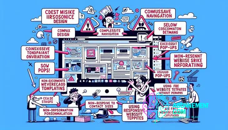
Effective web design requires avoiding common mistakes like overcomplicating navigation and neglecting mobile optimization, while focusing on clear calls to action and utilizing user feedback to enhance the overall user experience.
Web design mistakes can turn potential customers away before they even fully engage with your site. With the right approach, you can create a more inviting online space. Are you sure about your design choices?
Common web design mistakes to avoid
When it comes to creating websites, common web design mistakes can lead to a frustrating experience for users. It is important to understand these pitfalls to ensure a smooth interaction with your website.
Poor Navigation
Websites should have clear and intuitive navigation. Users should be able to find what they are looking for within a few clicks. If your navigation is confusing, visitors will likely leave in search of a better experience.
Overloading with Information
While you want to provide valuable content, overloading a page with too much information can overwhelm visitors. Use headings and bullet points to break up text and make it more digestible.
Inconsistent Design
Inconsistency in design can confuse users. Ensure that your font styles, colors, and button designs are uniform across all pages. This creates a cohesive look and feel.
Ignoring Mobile Users
With more users accessing websites on mobile devices, it’s crucial that your design is responsive. A site that does not adapt to different screen sizes can alienate a large portion of your audience.
Neglecting Loading Speed
A slow website can be a massive turn-off. Ensure your images are optimized and that your site is built on a fast hosting platform. A quick loading time enhances user experience.
Lack of Calls to Action
Every page should guide users towards a next step. Whether it’s signing up for a newsletter or making a purchase, calls to action should be clear and compelling.
Using Too Many Fonts and Colors
Stick to a limited palette of colors and a couple of fonts. This keeps your design clean and professional. Overusing different styles can create a chaotic appearance.
Forgetting Accessibility
Make sure your site is accessible to everyone, including people with disabilities. Use alt text for images and ensure that your site can be navigated by keyboard.
Not Testing Designs
Always run tests on your designs with real users. A/B testing different layouts and features can provide valuable insights into what works and what doesn’t.
The impact of slow loading times
The impact of slow loading times on a website can be significant. Users expect websites to load quickly, and delays can lead to frustration and abandonment.
User Experience Drops
When a site takes too long to load, user experience suffers. Users may lose interest and leave. Research shows that even a one-second delay can lower user satisfaction.
Search Engine Rankings
Search engines, like Google, consider loading speed as a ranking factor. If your site is slow, it may not rank well. A higher position can lead to more visitors and better engagement.
Increased Bounce Rates
Slow loading sites often have higher bounce rates. This means visitors leave without interacting. A high bounce rate indicates that users are not finding what they need.
Lost Revenue
For e-commerce sites, slow loading times can be costly. If customers face delays, they may abandon their shopping carts. This directly affects sales and revenue.
Negative Brand Perception
A sluggish website can create a negative perception of your brand. Users might assume that a slow website reflects poor service or quality. This can deter potential customers.
Strain on Resources
A slow loading site can consume more server resources, leading to higher costs. Optimizing speed reduces resource strain and can save money on hosting.
Need for Optimization
To improve loading times, it is vital to optimize images, reduce code bloat, and utilize caching. Simple changes can lead to significant improvements in performance.
Understanding the impact of slow loading times is crucial. Taking steps to enhance site speed not only improves user experience but also boosts your website’s effectiveness and success.
Why responsive design is essential
Responsive design is essential for modern websites. It ensures that users have a smooth experience on any device, whether it’s a computer, tablet, or smartphone.
Improved User Experience
When a website is responsive, it automatically adjusts to different screen sizes. This means users do not need to zoom in or scroll sideways to read content. A good experience keeps visitors engaged.
Increased Mobile Traffic
With more people using mobile devices, responsive design is a must. Websites that are not mobile-friendly may lose a significant portion of their audience. In fact, over half of all web traffic comes from mobile devices.
Better SEO Rankings
Search engines favor responsive sites. A responsive design improves your chances of ranking higher in search results. This is because Google considers mobile-friendliness as a ranking factor.
Simplified Management
With a responsive design, you only need to maintain one website instead of multiple versions. This can save time and effort when updating content or making changes. It simplifies your workflow.
Cost-Effectiveness
Investing in a responsive design can save money in the long run. You won’t need to create separate sites for desktop and mobile. This cuts down on development and maintenance costs.
Consistency in Branding
A responsive website provides a consistent brand experience. Whether customers visit from a desktop or a mobile device, they receive the same message and look. This strengthens brand identity.
Future-Proofing Your Site
As new devices come into the market, responsive design ensures your site remains accessible. It adapts to various screen sizes, making it a smart long-term investment.
Emphasizing the importance of responsive design is key for any website owner. By adopting this approach, you can enhance user satisfaction, improve SEO, and ensure your website is ready for the future.
Ignoring user experience principles
Ignoring user experience principles can lead to significant problems for your website. These principles are vital for keeping visitors engaged and satisfied.
Complex Navigation
If your website is hard to navigate, users will become frustrated. Simple and clear navigation menus help users find information quickly. Always design for ease of use.
Unattractive Design
A visually appealing site draws users in. If your design is outdated or cluttered, it can drive visitors away. Use appealing colors, fonts, and layouts to engage your audience.
Failure to Address User Needs
Your website should serve its audience. Ignoring what users need can result in a website that fails to deliver value. Always gather feedback and make adjustments based on the needs of your users.
Lack of Accessibility
Ensuring your site is accessible to everyone, including those with disabilities, is essential. Use alt text for images, proper heading structures, and design that works with assistive technologies.
Slow Response Times
Users expect quick response times. If your site lags or has broken links, visitors will leave. Regularly check and optimize your website for speed.
Poor Mobile Experience
With many users accessing websites on mobile devices, failing to provide a mobile-friendly experience is a mistake. Responsive design adapts to various screen sizes and improves engagement.
Navigating with Too Much Clutter
Overcrowded pages can confuse users. Keep content organized and prioritize important information. Use white space to create a cleaner look.
Adhering to user experience principles is crucial for a successful website. By prioritizing how users interact with your site, you can create a positive environment that encourages return visits and increases engagement.
Overcomplicating navigation
Overcomplicating navigation can significantly hinder a user’s experience on your website. Simplified navigation is key to retaining visitors and ensuring they can find the information they need quickly.
Too Many Choices
When a website has too many options in its navigation bar, users can feel overwhelmed. It’s essential to limit the number of menu items to the most relevant categories. This makes it easier for users to make decisions.
Confusing Labels
Navigation labels should be clear and descriptive. Using jargon or vague terms can confuse users. Instead, use straightforward language that accurately describes what users will find when they click a link.
Hidden Menus
Menus that require extra clicks or that are hidden can frustrate users. Ensure that all important links are easily accessible without making users search for them. A good practice is to keep primary navigation visible at all times.
Lack of Consistency
If your navigation changes from page to page, it can disorient users. Maintain consistent navigation throughout your website. This allows users to feel in control and familiar with your layout as they explore.
Overuse of Dropdowns
While dropdown menus can help organize content, relying too heavily on them can complicate navigation. Too many nested layers may confuse users and make it challenging to find desired information quickly.
Ignoring Mobile Users
Many users access websites via mobile devices, and complicated navigation does not translate well on smaller screens. Ensure navigation is mobile-responsive and intuitive for touch interactions.
Testing Navigation Effectiveness
Regularly testing your website’s navigation with real users can provide insight into areas that may need improvement. Gathering feedback helps ensure that your navigation meets user needs.
By addressing the issue of overcomplicating navigation, you can create a seamless experience for users. Simplified and intuitive navigation encourages visitors to stay longer and engage more with your content.
Neglecting mobile optimization
Neglecting mobile optimization can hurt your website’s performance and user engagement. With many users accessing the internet via smartphones, having a mobile-friendly site is essential.
Rising Mobile Usage
More than half of all web traffic comes from mobile devices. If your site isn’t optimized for mobile, you risk losing a significant number of visitors. The design should adjust seamlessly to different screen sizes.
Poor User Experience
Mobile users expect fast loading times and easy navigation. A site that is not optimized can lead to frustrating experiences, making users less likely to return. Simplified layouts and larger touch targets enhance usability.
Impact on SEO
Search engines like Google prioritize mobile-friendly sites in their rankings. If your site isn’t optimized, it may not appear high in search results, reducing visibility and traffic.
Speed Matters
Mobile optimization includes improving loading speeds. If your mobile site takes too long to load, users will abandon it. Compress images, reduce server response times, and minimize code to improve speed.
Responsive Design Benefits
A responsive design automatically adjusts to various screen sizes. This ensures that users have a consistent experience, whether they access your site from a phone, tablet, or desktop.
Testing on Multiple Devices
Regularly test your website on various devices and screen sizes. This helps identify issues that could frustrate mobile users. Gathering real user feedback is vital for making necessary improvements.
Keeping Content Concise
On mobile, content should be straightforward and concise. Long paragraphs may discourage reading. Use bullet points and headings to break up text and make it more digestible.
By addressing the issue of neglecting mobile optimization, you can enhance user experience and increase engagement, leading to better overall performance and satisfaction.
The importance of clear calls to action
The importance of clear calls to action (CTAs) cannot be overstated in web design. CTAs guide users on what steps to take next, improving engagement and conversions.
Directing User Behavior
CTAs help shape the user’s journey on your website. By using clear, compelling language, you can direct users to specific actions, such as signing up for a newsletter or making a purchase.
Increased Conversions
Websites with strong, clear CTAs often see higher conversion rates. When users know exactly what to do, they are more likely to follow through. It can be as simple as a button labeled “Buy Now” or “Subscribe Here.”
Enhancing User Experience
A well-placed CTA improves user experience by providing a clear path. Users appreciate knowing what is expected of them, which keeps them engaged and reduces frustration.
Utilizing Visual Hierarchy
Using design elements like color, size, and placement can make CTAs stand out. Make sure they are easily noticeable so they draw the user’s eye and prompt action.
Testing and Refining
Regularly testing different CTAs is crucial. A/B testing allows you to see what wording, design, and placement work best. Using analytics, determine which CTAs lead to the most conversions.
Creating Urgency
Incorporate urgency into your CTAs. Phrases like “Limited Time Offer” or “Sign Up Today” can encourage immediate action. Users may feel more compelled to act quickly.
Mobile Optimization
CTAs must also be optimized for mobile users. Ensure buttons are large enough to tap easily and that they lead to a seamless experience. Mobile-friendly design enhances engagement.
By recognizing the importance of clear calls to action, you can effectively guide your users and enhance the overall performance of your website.
Using too many fonts and colors
Using too many fonts and colors on a website can create a chaotic and unprofessional appearance. It’s essential to maintain visual consistency to ensure a positive user experience.
Visual Clutter
When a website uses multiple fonts and colors, it can overwhelm visitors. A clean and simple design is more enjoyable to navigate. Limit choices to a few font families and a color palette that complements your brand identity.
Brand Identity
Consistent use of fonts and colors enhances brand recognition. Users should easily associate specific colors and fonts with your brand. This builds trust and familiarity, making it more likely for users to return.
Readability Issues
Not all fonts are easy to read. Using too many different styles can confuse users and make your content hard to read. Prioritize legibility by selecting fonts that are straightforward and complementary to one another.
Mobile Compatibility
Many users access websites from mobile devices. Using too many fonts and colors can lead to display issues, particularly on smaller screens. Ensure that your design remains cohesive and functional across all devices.
Guidelines for Fonts
Stick to 2-3 different fonts throughout your site: one for headings, one for body text, and possibly one for accents. This approach creates a harmonious design that is both attractive and easy to navigate.
Color Theory Basics
Understanding basic color theory can help guide your choices. Use colors that evoke the right emotions and maintain a balance between contrast and harmony. A well-thought-out color scheme can enhance user engagement.
Testing and Feedback
Before finalizing your design, gather feedback from users. Run tests to see how different combinations of fonts and colors perform. This can provide valuable insights into what works best for your audience.
By adhering to the principles of using too many fonts and colors, you can create a cleaner and more effective website that resonates with users and strengthens your brand image.
Listening to user feedback effectively
Listening to user feedback effectively is crucial for improving your website and enhancing user experience. By actively seeking and implementing feedback, you can address user concerns and meet their needs more accurately.
Importance of User Feedback
User feedback provides valuable insights into what works and what doesn’t on your site. It helps identify issues that you might not be aware of. By understanding user experiences, you can make informed decisions on improvements.
Creating Feedback Channels
Establish clear channels for users to share feedback. This can include surveys, comment sections, or feedback forms. Make it easy for users to provide their thoughts and suggestions.
Conducting Surveys
Surveys are an effective way to gather structured feedback. Use simple, targeted questions to assess user satisfaction and gather specific insights. Keep surveys short to encourage participation.
Analyzing Feedback
Once you gather feedback, analyze it for common themes or issues. Look for patterns that indicate recurring problems or areas for improvement. Prioritize addressing the most critical feedback first.
Implementing Changes
After analyzing feedback, take action. Implement changes based on the insights you receive. Communicate these changes to users to show that their input is valued and taken seriously.
Closing the Feedback Loop
Let users know how their feedback has influenced changes. This builds trust and encourages future participation. Providing updates can also enhance user engagement.
Continuous Improvement
Listening to user feedback should be an ongoing process. Regularly seek feedback even after making changes. Continual improvement helps ensure your website stays relevant and user-friendly.
By effectively listening to user feedback, you can create a better user experience, increase satisfaction, and ultimately drive greater success for your website.
In conclusion, improving your web design matters
From avoiding common mistakes to ensuring a great user experience, paying attention to details can make a big difference. Simple actions like clear calls to action, mobile optimization, and effective use of fonts and colors will help engage users.
Listening to user feedback is equally important. By gathering and analyzing feedback, you can continuously improve your site to better meet user needs.
Ultimately, a well-designed website not only attracts visitors but helps turn them into loyal customers. Keep these principles in mind to create a successful online presence.


