
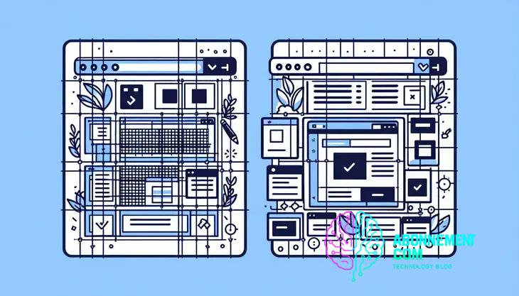
How Grid Systems Improve Web Layout
Web design grid system helps create balanced, user-friendly layouts that engage visitors and streamline your design process.
A web design grid system organizes content visually, enhancing usability and aesthetics through structured layouts like fixed, fluid, or responsive grids, while tools and best practices ensure effective implementation.
Web design grid system can transform how websites are structured and perceived by users. Ever thought about how your layout choices affect engagement? Let’s dive in!
Understanding the web design grid system
Understanding the web design grid system is essential for creating visually appealing and user-friendly websites. A grid system acts as a framework that helps designers align elements and organize content efficiently. This structure simplifies the design process and ensures consistency across different pages.
A grid typically consists of columns and rows, creating a modular structure. By using a grid, designers can balance text, images, and other elements within a layout, leading to a more harmonious and effective user experience. Many common grid systems include the 12-column grid, which is flexible and adaptable to various screen sizes.
Why Use a Grid System?
There are several reasons to implement a grid system in web design. Initially, it provides structure, allowing designers to create layouts that guide users’ visual flow. A cohesive look is created when all elements align properly within the grid, improving the overall aesthetic.
Moreover, grids enhance responsiveness. With a structured layout, web pages can adapt seamlessly to different devices, ensuring usability on desktops, tablets, and smartphones. This adaptability is vital in today’s multi-device environment.
How to Choose the Right Grid System
Selecting the appropriate grid system depends on your design goals. Consider the type of content you’ll display and the user experience you want to deliver. For instance, a more complex website may benefit from a fluid grid, while simpler sites might utilize a fixed grid.
Experiment with different grid layouts in your projects. Testing various configurations enables you to discover which works best for your specific design style and audience needs.
Benefits of using a grid system in web design
The benefits of using a grid system in web design are numerous and can greatly enhance both the design process and the final product. By utilizing a grid, designers can create a more organized layout that improves visual hierarchy. This organization helps guide users through the content in a logical manner.
One major advantage is consistency. When all elements align within a grid, it creates a uniform appearance across different pages. This consistency boosts brand recognition and fosters trust among users, as they feel more comfortable navigating an orderly environment.
Enhanced Responsiveness
Another benefit is the grid system’s ability to enhance responsiveness. With a solid foundation, designs can adjust smoothly to various screen sizes. A proper grid ensures that content remains accessible and visually appealing, whether viewed on a smartphone or a desktop.
Efficient Collaboration
A grid system can streamline collaboration among team members involved in the design process. By adhering to a shared grid framework, designers and developers can communicate more effectively, reducing the chances of misalignment or inconsistencies in the final product.
Additionally, grids save time. They allow designers to create layouts faster, as the framework provides clear guidelines for placing elements. This efficiency can lead to quicker project completion without sacrificing quality.
Improved User Experience
Ultimately, the use of a grid system leads to an improved user experience. A well-structured design helps users find information quickly and effortlessly, minimizing frustration. When users can easily navigate a website, they are more likely to stay longer and engage with the content.
Types of grid systems: fixed, fluid, and responsive
Understanding the different types of grid systems is crucial for effective web design. The three main types are fixed, fluid, and responsive grids. Each type has its unique features and benefits.
A fixed grid system uses a set width that does not change, regardless of the screen size. This means elements on the page will stay the same size, which can simplify the design. However, this approach may lead to issues on smaller screens, as content can overflow or become difficult to view.
Fluid Grid Systems
In contrast, a fluid grid system is more adaptable. It uses percentages instead of fixed measurements, allowing elements to scale based on the viewport size. This flexibility makes fluid grids suitable for a variety of devices, providing a better user experience across different screen sizes.
Responsive Grid Systems
The most modern approach is the responsive grid system. This system combines fixed and fluid features, enabling designs to adjust not only to different screen sizes but also to orientation and resolution. Using media queries and flexible layouts, responsive grids ensure that content is always displayed optimally, regardless of the device used.
Choosing the right grid system depends on your project’s goals. Consider the type of content you have and how users will interact with your site. Each grid system has its advantages, so understanding these options is key to effective design.
How to create a grid system for your website
Creating a grid system for your website is essential for achieving a balanced and functional layout. Here are some clear steps to design and implement an effective grid system.
Firstly, decide on the number of columns your grid will have. A common choice is a 12-column grid, which offers flexibility for layout options. Using an even number of columns allows for easy division and combinations.
Set a Grid Width
Next, determine the overall width of your grid. This width should suit a variety of screen sizes. A typical width for desktop designs is around 1200 pixels. For fluid grids, consider using percentages to allow for adaptation on smaller devices.
Define Gutter Size
Gutters are the spaces between columns that help separate content. Choose an appropriate gutter size, typically between 15 to 30 pixels. This space is important for readability and aesthetics. Functionally, proper gutters prevent content from appearing cramped.
Create a CSS Framework
Once you have these dimensions settled, it’s time to create your CSS framework. Use CSS classes to define the grid structure. For example, class names like `.col-1`, `.col-2`, etc., can represent the number of columns an element will occupy. You can use flexbox or grid layout properties to manage the layout effectively.
Test Your Grid
Finally, it’s crucial to test your grid on various devices and screen sizes. Responsive testing tools can help ensure that your grid adapts well to different resolutions. Adjust column widths and gutter sizes as necessary to enhance usability.
Best practices for implementing grid systems
Implementing a grid system effectively involves following some best practices to ensure your design is both functional and visually appealing. Here are key practices to consider.
First, start with a clear plan. Before diving into coding, outline the overall structure of your grid system. Decide on the number of columns, gutter sizes, and overall width. Having a detailed layout in mind decreases confusion and helps in creating a coherent design.
Consistency is Key
Maintain consistency throughout your layout. Use the same grid structure across all pages of your website. This unifies the user experience and makes navigation easier for your audience. It also reduces the effort needed for updates and changes.
Use Responsive Design
Incorporate responsive design techniques. Your grid should adapt seamlessly to various screen sizes and devices. Utilize media queries in your CSS to adjust column widths and layouts based on screen resolution, ensuring a pleasant user experience.
Test and Iterate
Regularly test your grid system during development. Use different browsers and devices to see how your grid performs. Make adjustments as needed based on user feedback and testing results. Iteration is key to refining your design.
Utilize CSS Frameworks
Consider using established CSS frameworks, like Bootstrap or Foundation. These frameworks come with predefined grid systems, saving time and effort. They also ensure that your grid design follows best practices and is built to be responsive.
Lastly, keep learning. The web design landscape is always evolving, so stay updated on the latest trends and technologies related to grid systems.
Common mistakes to avoid with grid layouts
When working with grid layouts, it is important to avoid common mistakes that can undermine the effectiveness of your design. Here are some key pitfalls to watch out for.
One frequent mistake is overcrowding the layout. When too many elements are crammed into a grid, it can lead to confusion and a poor user experience. Make sure to maintain adequate spacing between elements to create clarity.
Ignoring Responsiveness
Another common error is neglecting responsive design. Grids must adapt to different screen sizes. Failing to implement responsive breakpoints can result in layouts that look good on a desktop but are unusable on mobile devices.
Inconsistent gutter sizes
Inconsistent gutter sizes between columns can disrupt the flow of the design. Always use uniform gutter sizes across your grid layout to maintain a clean and organized appearance. This consistency is key for a professional look.
Static Widths in a Fluid Environment
Using static widths in a fluid grid can cause elements to break on varied screen sizes. Instead, leverage percentages to allow components to resize dynamically based on the viewport.
Forgetting About Accessibility
Lastly, do not overlook accessibility. Make sure that color contrasts are sufficient and that the layout remains navigable for all users, including those with disabilities. Remember that a well-designed grid should enhance usability for everyone.
Tools and resources for grid system design
There are various tools and resources available for designing effective grid systems that can streamline your workflow. Here’s a list of some essential tools to consider.
First, Adobe XD is a popular design tool that allows you to create grids easily. Its features enable you to set up columns, gutters, and rows quickly, giving you a clear layout for your designs.
Figma
Another powerful tool is Figma, which is web-based and great for collaboration. Figma allows multiple users to work on a design in real-time. It also offers layout grids and constraints that help maintain a consistent structure across devices.
Sketch
Sketch is a favorite among many web designers. It includes features for creating grid systems and offers reusable components. Its simplicity and focus on web design make it a go-to choice for many.
CSS Frameworks
Utilizing CSS frameworks, like Bootstrap or Foundation, is also beneficial. These frameworks come with predefined grid systems and responsive design features, allowing you to implement grids quickly and efficiently.
Grid Generator Tools
There are also several grid generator tools available online, such as Grid Layoutit and CSS Grid Generator, which simplify the process of creating custom grids and provide you with the corresponding CSS code. These tools are excellent for beginners and help streamline the design process.
Finally, online platforms like Dribbble and Behance can serve as valuable resources for inspiration. Browsing through projects on these sites can spark new ideas and showcase various approaches to grid layouts.
Case studies of successful grid system implementations
Examining case studies of successful grid system implementations can provide valuable insights into how effective design leads to great user experiences. Here are some examples that highlight best practices.
One notable case is the redesign of Apple’s website. They used a grid system to create a clean and organized layout, making it easy for users to find products and information. The use of ample white space and a modular grid allowed for clear navigation and improved engagement.
Grid Implementation at The New York Times
The New York Times effectively utilized a responsive grid system in their website design. This approach allows content to flow seamlessly across devices, ensuring readers have an optimal experience, whether on a mobile phone or desktop. The grid structure aids in presenting articles and images cohesively.
Airbnb’s Visual Layout
Airbnb is another example. They employ a grid to showcase listings efficiently, allowing users to browse properties quickly. The grid adapts to different screen sizes, maintaining usability while displaying attractive images and essential information about each listing.
Dropbox’s Simplified Design
Dropbox also illustrates successful grid implementation. Their website uses a minimal grid layout that provides a clear user path. By eliminating distractions and focusing on key features, they enhance user engagement and simplify the user experience.
These case studies highlight that when grid systems are applied thoughtfully, they can significantly improve both functionality and aesthetics, leading to increased user satisfaction and retention.
Future trends in web design grid systems
The future trends in web design grid systems indicate significant changes in how designers approach layouts. One major trend is the increasing use of CSS Grid Layout. This powerful tool allows for complex designs and offers more flexibility compared to traditional frameworks.
Another key shift is the emphasis on responsive design. As mobile usage continues to rise, designers are focusing on creating grids that adapt fluidly to various screen sizes, making UX a priority across all devices.
Integration of AI
Artificial Intelligence is also starting to play a role in grid system design. AI can help optimize layouts based on user behavior, ensuring that the most relevant content is highlighted for each visitor, enhancing overall user engagement.
Minimalism and Clean Designs
There is a growing trend towards minimalism. Many designers are opting for cleaner layouts with fewer distractions. This trend often leads to the use of more white space and a focus on essential elements within the grid, promoting clarity and ease of navigation.
Dynamic Grids
Dynamic grids are sets to become more mainstream. These grids adjust automatically based on content size and type, allowing for more creativity and flexibility in designs. This helps to improve performance by loading content as needed and reducing clutter.
Finally, the importance of accessibility will continue to guide design choices. Future grid systems will prioritize features that enhance usability for all users, ensuring that websites are navigable and understandable.
Recap of Web Design Grid Systems
In conclusion, understanding and effectively implementing web design grid systems can greatly enhance the user experience. By utilizing fixed, fluid, or responsive grid types, designers can create layouts that are both functional and visually appealing.
Adopting best practices, avoiding common mistakes, and leveraging modern tools will lead to better-designed websites. The case studies of successful grid implementations show how a well-structured grid can improve navigation and engagement.
Looking forward, trends like dynamic grids and AI integration will shape the future of web design. As technology evolves, staying informed and adaptable will be key for designers.
Remember, a well-thought-out grid system is not just about aesthetics; it’s about delivering a seamless experience that keeps users coming back.


