
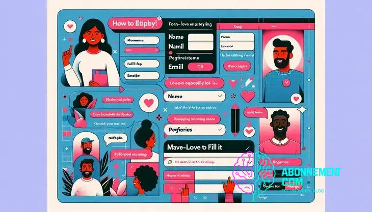
Designing Forms That Users Love to Fill
Form design UX is crucial for enhancing user engagement and satisfaction. Discover practical tips to optimize your forms.
Using analytics to improve form performance involves tracking key metrics, analyzing user behavior, and making data-driven adjustments to enhance user experience and increase completion rates.
Form design UX plays a pivotal role in how users interact with digital interfaces. Have you ever encountered a form that was so confusing you didn’t bother to fill it out? Let’s dive into strategies to create forms that not only function well but also delight users.
Understanding the principles of form design UX
Understanding the principles of form design UX is essential for creating effective digital interfaces. A well-designed form can significantly impact user satisfaction and engagement.
Key Principles of Form Design
Start by prioritizing clarity. Each field in your form should have clear labels, making it easy for users to understand what information is required. Use concise language and avoid jargon.
Grouping Related Fields
Group related fields together to improve user flow. This can help users navigate your form more intuitively. For example, combine first name and last name fields or address components. This minimizes cognitive load and enables users to fill out forms faster.
Visual Hierarchy
Utilizing visual hierarchy is crucial in guiding users through your form. Highlight the most important elements, such as call-to-action buttons, using size, color, or whitespace. This leads users naturally to the completion of the form.
Responsive Design
Your forms should be mobile-friendly as many users access websites from their phones. Ensure fields are appropriately sized for touch inputs and that the design adjusts seamlessly to different screen sizes.
Inline Validation
Offering inline validation during form completion helps users correct mistakes on the spot, rather than waiting to submit the form. This reduces frustration and improves user experience.
Feedback and Confirmation
Provide clear feedback once a form is submitted. A simple thank you message or confirmation number reassures users that their information has been received.
The impact of user experience on form completion rates
The impact of user experience on form completion rates cannot be overstated. A positive experience encourages users to complete forms rather than abandon them.
First Impressions Matter
When users land on a form, their first impression can dictate the likelihood of completion. A clean, organized layout with clear instructions helps build trust and encourages users to proceed.
Reducing Friction in the Process
Minimizing friction is crucial. This means keeping forms as short as possible, only asking for necessary information. The fewer fields users need to fill out, the higher your completion rates will be.
Visual Cues and Guidance
Including visual cues can significantly aid users. Use tooltips or examples within input fields to show users exactly what you’re looking for. This guidance can prevent confusion and mistakes, leading to higher satisfaction and completion.
Progress Indicators
When forms consist of multiple steps, incorporating progress indicators can keep users informed and motivated. Allowing users to see how far they’ve come can encourage them to continue filling out the form.
Mobile Optimization
As many users access forms on mobile devices, ensuring that forms are optimized for mobile is essential. Responsive design improves accessibility and user experience, leading to better completion rates.
Feedback Mechanisms
Providing immediate feedback for user inputs can be instrumental. For example, showing a checkmark next to successfully completed fields reassures users that they are progressing correctly.
Testing and Iteration
Finally, regularly testing forms to gather user feedback is vital for continuous improvement. Observing how real users interact with your forms can uncover pain points that need addressing.
Best practices for designing accessible forms
Designing accessible forms is crucial to ensure that all users, including those with disabilities, can interact with your website effectively. Following best practices can significantly enhance user experience.
Use Clear and Descriptive Labels
Each form field should have a clear and descriptive label. This helps users understand what information is required. Use simple language and ensure labels are easy to read.
Provide Error Messages
When a user makes a mistake, provide clear and constructive error messages. Be specific about what went wrong and how to fix it. This guidance helps users make corrections easily.
Keyboard Navigation
Make sure your forms are accessible via keyboard navigation. Users with mobility impairments may not use a mouse, so all fields, buttons, and navigation should be operable with keyboard shortcuts.
Color Contrast and Size
Ensure there is a strong contrast between text and background colors. This aids visibility for users with visual impairments. Additionally, make form elements large enough for easy clicking or tapping.
Provide Instructions and Examples
Include instructions and examples where necessary. For complex fields, brief descriptions can help users understand how to complete them. This reduces the likelihood of errors.
Use Accessible Formats
Design forms that are compatible with screen readers and other assistive technologies. This includes using proper HTML semantics and ensuring that all interactive elements are labeled correctly.
Test with Real Users
Involve users with disabilities in the testing phase. Collect their feedback to identify barriers and improve accessibility. This ensures your forms are user-friendly for everyone.
How to simplify complex forms for better usability
Simplifying complex forms is essential to enhance usability and improve user experience. By making forms more straightforward, users are more likely to complete them without frustration.
Break It Down into Steps
Dividing long forms into smaller, more manageable steps helps users feel less overwhelmed. Use a multi-step format where users can see their progress, making them more willing to complete the process.
Limit Required Fields
Only ask for essential information. Reducing the number of required fields minimizes cognitive load and encourages users to fill out the form entirely. Make optional fields clear to avoid confusion.
Use Clear Instructions
Provide clear instructions next to complex fields. This guidance helps users understand what is expected, especially in areas that might be confusing. Use simple language and examples where needed.
Include Smart Defaults
By pre-filling sections with smart defaults, you can save users time. For instance, automatically filling in country information based on IP address helps simplify their experience.
Utilize Conditional Logic
Implementing conditional logic allows users to see only relevant fields based on their previous answers. This keeps the form uncluttered and focused, improving usability.
Provide Visual Aids
Using visual aids, such as icons or images, can clarify the information required in each field. These elements can make the form more engaging and easier to navigate.
Test and Iterate
Continuously test your forms with real users to identify areas of confusion. Gathering feedback helps you refine and simplify the form to better meet user needs.
Incorporating visual hierarchy in your form design
Incorporating visual hierarchy in your form design is essential for guiding users through the completion process. A well-structured form can enhance usability and drive higher completion rates.
Understanding Visual Hierarchy
Visual hierarchy refers to the arrangement of elements in a way that clearly indicates their importance. By prioritizing important fields or actions, you can help users navigate more easily.
Use Size and Weight
Utilize variations in size and weight for text to draw attention to key elements. For example, make labels bold for required fields or use larger font sizes for headings to establish a clear structure.
Implement Color Coding
Color can effectively highlight elements that need focus. Using contrasting colors for action buttons or required fields makes them stand out and signals to users where to direct their attention.
Organize with Spacing
Proper spacing between fields plays a critical role. Use whitespace to separate distinct sections or groups. This prevents the form from feeling cluttered and helps users process information more comfortably.
Order of Information
Place information in a logical order that aligns with user expectations. Generally, users prefer to input personal details, followed by contact information and payment details. Organizing fields in this way reduces confusion.
Group Related Fields
Creating groups for related information simplifies the form visual. For instance, cluster first name and last name together. This organization aids users in understanding what is asked, fostering quicker completion.
Highlight Call-to-Action Buttons
Ensure that your call-to-action buttons are prominent. Using distinct colors and larger sizes can draw the user’s eye and encourage them to complete the submission process.
Using micro-interactions to enhance user feedback
Using micro-interactions is a powerful way to enhance user feedback throughout the form completion process. These small, subtle animations or changes can significantly improve the overall user experience.
What Are Micro-Interactions?
Micro-interactions are brief moments of user engagement. They occur when a user performs an action, like clicking a button or entering information. These interactions provide immediate feedback and help users understand the outcome of their actions.
Provide Immediate Feedback
When users submit a form, instant feedback is essential. Consider using a brief animation or color change to indicate successful submission. This assures users that their action was recognized.
Guide with Progress Indicators
Implementing progress indicators is effective, especially in multi-step forms. Showing users how many steps are left can motivate them to continue. Use visual cues like checkmarks or progress bars to enhance understanding.
Highlight Errors Clearly
When errors occur, it’s vital to communicate these clearly. Use animations, like shaking a field, to draw attention to mistakes. Also, provide text explaining what went wrong and how to fix it.
Encourage Actions with Animation
Animation can add personality to your forms. For example, when a user hovers over a button, a slight scale increase can make it more inviting. This encourages engagement and improves usability.
Use Timely Notifications
Real-time notifications can enhance user experience during completion. For instance, showing suggestions or confirming inputs as users type can help clarify what is required, making the process smoother.
Test and Optimize
Regularly testing your micro-interactions is important. Gather user feedback to see what works effectively. Adjusting based on real user responses can significantly enhance interaction and satisfaction.
Testing your forms for optimal user experience
Testing your forms for optimal user experience is crucial to ensure they meet the needs of all users. Regular testing helps identify issues that might hinder completion rates.
Gather User Feedback
Start by gathering feedback from real users. Conduct usability tests to observe how users interact with your forms. Note any areas where they struggle or express confusion.
Use A/B Testing
A/B testing allows you to compare two versions of a form. You can test different layouts, colors, or wording to see which performs better. This data-driven approach helps optimize user experience.
Monitor Analytics
Utilizing analytics tools can provide insights into how users interact with your forms. Track completion rates, drop-off points, and time spent on each field. Analyzing this data reveals potential problem areas.
Perform Accessibility Testing
Make sure your forms are accessible to all users, including those with disabilities. Use tools to check color contrast, keyboard navigation functions, and screen reader compatibility to ensure inclusivity.
Consider Mobile Compatibility
With many users accessing forms on mobile devices, testing for mobile compatibility is key. Verify that forms are responsive and easy to navigate on different screen sizes and devices.
Iterate Based on Findings
After testing, iterate on your forms based on the feedback and data collected. Make the necessary changes and test again. This continuous improvement cycle is vital for enhancing user experience.
Document Changes and Results
Keep track of all changes made and the results of your testing. Documenting these can help you understand what strategies were effective and why they worked, providing valuable insights for future form designs.
Common mistakes in form design and how to avoid them
Understanding common mistakes in form design is crucial for creating effective user experiences. Avoiding these pitfalls can lead to higher completion rates and improved user satisfaction.
Overloading with Fields
One common error is asking for too much information at once. Keep forms concise and only request essential details. Users are more likely to complete shorter forms.
Poor Labeling
Using unclear or vague labels can confuse users. Ensure all fields have clear and descriptive labels. This improves understanding and helps users know exactly what to fill in.
Neglecting Mobile Users
Many users access forms on mobile devices. Failing to optimize for mobile can lead to frustration. Always ensure your forms are responsive, with touch-friendly elements.
Not Providing Feedback
Users need feedback during completion. Without it, they may feel uncertain about their progress. Use real-time validation messages to inform users of errors or confirmations.
Ignoring Accessibility
Accessibility is often overlooked in form design. Ensure your forms are usable for people with disabilities. Implement proper HTML tags and ensure there is adequate contrast for visibility.
Complex Navigation
A confusing layout can deter users from completing forms. Organize fields logically and use sections to make navigation intuitive. Consider using steps or progress indicators for longer forms.
Failing to Test
Lastly, not testing forms before launch is a serious mistake. Conduct usability testing to identify issues. Gather feedback to ensure the form meets user needs.
Leveraging analytics to improve form performance
Leveraging analytics is vital for improving form performance. By analyzing data, you can identify areas for enhancement and increase overall user engagement.
Track Key Metrics
Start by tracking essential metrics related to your form. Focus on completion rates, average time spent on the form, and drop-off points. These data points help you understand where users struggle.
Analyze User Behavior
Utilize tools like heat maps to visualize user interactions. Heat maps show where users click and how they navigate your forms. This insight allows you to optimize layout and design.
Segment Your Audience
Segmenting your audience can lead to more specific insights. Analyze how different user groups interact with your forms. This helps tailor the experience to meet various needs and preferences.
Conduct A/B Testing
A/B testing can provide valuable information on what works best. Test different versions of form elements, such as button colors or field placements, to see which yields better performance metrics.
Gather Qualitative Feedback
Besides quantitative data, gather qualitative feedback from users. Surveying users after form submission can provide insights into their experience and highlight areas needing improvement.
Optimize Based on Findings
Once you collect and analyze your data, make informed changes to your forms. Whether that’s simplifying fields or adjusting layout, use the insights gained to enhance functionality.
Monitor Changes Over Time
After implementing changes, continue to monitor analytics. Keep an eye on how modifications impact user behavior to assess effectiveness. Regular monitoring helps maintain optimal form performance.
In summary, optimizing your forms is essential for success
By applying best practices in form design, you can improve user experience and increase completion rates. Focus on clarity, accessibility, and layout to make forms user-friendly.
Analyzing user data and feedback helps you identify areas for improvement, while testing different versions can reveal what works best.
Utilizing these strategies allows you to create effective forms that meet the needs of your users and enhance overall engagement.
Don’t overlook the power of small changes; they can lead to substantial improvements in form performance.


