
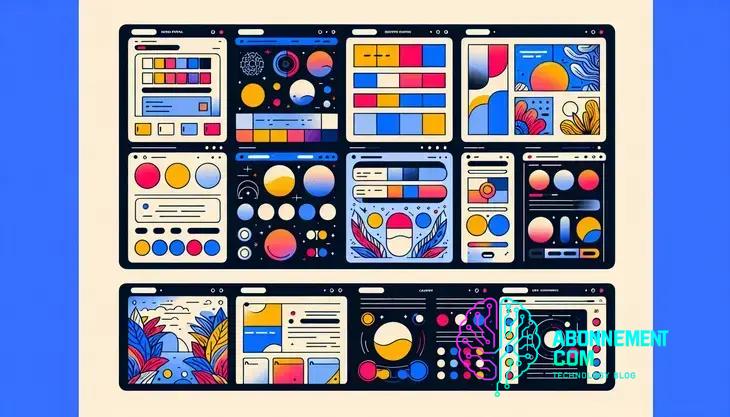
Best Color Schemes for Modern Websites
Website color schemes play a vital role in user experience and engagement. Discover how to choose the right palette.
Effective color schemes in web design enhance user experience by improving readability, guiding user actions, and aligning with brand identity, while avoiding common mistakes like poor contrast and overwhelming combinations.
Website color schemes can have a huge impact on your site’s success. Have you ever wondered how the right colors influence your visitors? In this article, we’ll explore how to choose the perfect color palette for your website.
Understanding the psychology of colors
Understanding the psychology of colors is essential for creating effective website color schemes. Different colors can evoke various emotions and reactions from visitors. For example, warm colors like red and orange can create a sense of excitement or urgency, while cool colors like blue and green often convey tranquility and trust.
Red and Orange
Red is often associated with passion and energy. It can grab attention quickly, making it a great choice for calls to action or alerts. Similarly, orange combines the energy of red with the friendliness of yellow, often used to encourage spending.
Blue and Green
Blue, on the other hand, is considered calming and is widely used by brands wanting to promote trust. It’s popular among banks and tech companies. Green is associated with nature and health, making it a perfect choice for eco-friendly brands.
Yellow and Purple
Yellow evokes happiness and optimism, but it can also be overwhelming if overused. It’s best utilized as an accent color. Purple, historically linked to royalty, often represents luxury and sophistication, making it a viable choice for high-end brands.
It’s crucial to consider cultural differences when choosing colors as well. For instance, while white signifies purity in some cultures, it may represent mourning in others. Understanding these nuances can help tailor your website color scheme to your target audience.
Incorporating these psychological insights into your color choices can lead to better user engagement and higher conversion rates. Experimenting with different color schemes while keeping these principles in mind can help you find the perfect fit for your brand.
How color schemes impact user behavior
Color schemes can significantly affect user behavior on a website. The colors you choose can influence how visitors perceive your brand and their overall experience on your site. For instance, vibrant colors can attract attention, while softer tones can create a calming effect.
Emotional Response
Colors evoke emotional responses that can sway user actions. For example, red often creates a sense of urgency, which can drive users to take immediate action. This is why many sale buttons are red. Alternatively, blue is linked with trust and security, making it a popular choice for banking and finance websites.
First Impressions
When users land on your site, they form an impression within seconds, largely influenced by your color scheme. A well-designed color palette can engage users and encourage them to explore more content. Conversely, a poorly chosen color scheme can lead to quick exits.
Readability and Accessibility
The readability of site content is also affected by color schemes. High contrast between text and background colors makes content easier to read. For instance, dark text on a light background usually works well. Additionally, accessibility is crucial; using color combinations that accommodate color blindness can enhance user experience.
Navigational Influence
Color schemes impact navigation by guiding users’ eyes to key elements like buttons and links. Using consistent colors for actions such as ‘Buy Now’ or ‘Learn More’ helps visitors quickly identify what to do next. When users know where to click, they are more likely to engage with your content.
Conversion Rates
The right colors can boost conversion rates. A/B testing different color schemes can show how subtle changes affect user interactions. For instance, changing a button color from green to orange might alter click-through rates. Experimentation can identify what colors resonate best with your audience.
Choosing colors for your brand identity
Choosing colors for your brand identity is a crucial step in defining how customers perceive your business. The colors you select communicate your brand’s values and message. It’s important to align your color choices with your brand’s personality.
Understanding Your Audience
The first step in choosing colors is understanding your target audience. Demographics such as age, gender, and culture can greatly influence color preferences. For instance, younger audiences may prefer vibrant, trendy colors, while older audiences might lean towards more subdued tones.
Aligning with Brand Values
Next, consider your brand values. If your brand promotes sustainability, greens and browns might reflect your commitment to the environment. If your focus is on luxury, rich colors like deep purple or gold can communicate that sense of exclusivity.
Color Psychology
Color psychology plays a vital role in brand identity. Colors can evoke different emotions; for instance, blue typically conveys trust and dependability, making it ideal for financial services. Red often signifies excitement and action, suitable for brands in the food or entertainment industry.
Creating a Color Palette
Once you have identified the right colors, it’s time to create a cohesive palette. A well-balanced color palette often contains a primary color, a secondary color, and a few accent colors. This will ensure versatility and consistency across different marketing materials.
Testing Your Color Choices
After selecting your colors, it’s wise to test them with your audience. A/B testing can provide insights on how different color schemes perform. Gathering feedback ensures your choices resonate well and support your brand goals.
Ultimately, the colors you choose should reflect your brand’s identity and engage your audience effectively. Great color choices can enhance brand recognition and encourage customer loyalty.
Tips for creating harmonious color palettes
Creating harmonious color palettes is vital for effective web design. A well-thought-out color scheme enhances user experience and strengthens brand identity. Here are some key tips to consider:
Understand Color Relationships
Begin by learning about color relationships on the color wheel. Colors can be complementary (opposite each other), analogous (next to each other), or triadic (three colors evenly spaced). Each relationship creates different visual dynamics.
Limit the Number of Colors
To maintain a cohesive look, limit your color palette to 3-5 colors. This helps prevent overwhelming your visitors. Choose a primary color, one or two secondary colors, and a couple of accent colors.
Use Tints and Shades
Adding tints (lighter versions) and shades (darker versions) of your base colors can enhance depth and variety without introducing new colors. This technique promotes harmony while adding visual interest.
Consider Contrast for Readability
Ensure there is adequate contrast between text and background colors. High contrast improves readability. Typically, dark text on a light background or light text on a dark background works best.
Test Your Palette
What looks good on paper may not always translate well online. Be sure to test your color palette on different devices and screens. Get feedback from users to see how they perceive your color choices.
Stay on Brand
Your color palette should align with your brand’s identity and values. Consider the emotions and messages associated with your chosen colors. Consistency in color usage across all platforms helps reinforce brand recognition.
Using color schemes for better accessibility
Using color schemes for better accessibility is essential to ensure all users can interact with your website effectively. Many people have different levels of color vision, so choosing colors wisely can help create an inclusive environment.
Understanding Color Blindness
Approximately 1 in 12 men and 1 in 200 women have some form of color blindness. The most common types are red-green color blindness and blue-yellow color blindness. It’s important to select colors that are distinguishable for everyone, regardless of their color vision.
High Contrast for Readability
One key aspect of accessibility is ensuring there is high contrast between text and background colors. A contrast ratio of at least 4.5:1 for normal text and 3:1 for large text is recommended. This makes it easier for users to read content without straining their eyes.
Avoiding Problematic Color Combinations
Certain color combinations can be particularly challenging for those with color blindness. For instance, using red and green together is a common pitfall. Instead, use textures, shapes, or labels in addition to colors to communicate information.
Testing for Accessibility
Testing your color choices with tools designed for accessibility can help identify potential issues. Tools like Color Contrast Analyzer and Axe Accessibility Checker can provide feedback on color contrast and overall accessibility.
Providing Alternative Text
It’s essential to provide alternative text descriptions for colored elements. This ensures that users who rely on screen readers can understand the content. Descriptive alt text gives context, making the website more usable for everyone.
Incorporating these accessibility practices into your color scheme design not only benefits users with disabilities but also enhances the overall user experience for all visitors.
Trendy color schemes for 2023 websites
Choosing the right color schemes can set your website apart in 2023. Here are some of the trending color schemes that can enhance your site’s appeal:
Soft Pastels
Soft pastel colors are becoming increasingly popular this year. These gentle hues create a calming effect and are pleasing to the eye. Shades like lavender, mint green, and baby blue can give your website a fresh and modern look.
Bold and Bright
In contrast to pastels, bold and bright colors also make a strong statement. Colors like electric blue, neon pink, and vibrant yellow can energize your design. Such color schemes are eye-catching and help convey a sense of creativity and enthusiasm.
Earthy Tones
Earthy tones like terracotta, olive green, and rich browns are trending as people seek comfort and authenticity. These colors evoke a sense of nature and sustainability, making them perfect for brands focused on eco-friendliness.
Monochromatic Palettes
Monochromatic color schemes, which use variations of a single hue, provide a clean and streamlined look. This approach can enhance the sophistication of your design. For example, using shades of blue from light sky to deep navy will create a cohesive and stylish appearance.
Neutrals with a Twist
Neutrals remain timeless, but this year, they’re being paired with unexpected colors. For instance, a classic gray or beige can be paired with a pop of coral or teal for a fresh take. This creates visual interest while keeping the overall design grounded.
Color Gradients
Color gradients are also making a comeback. They add depth and movement to a design, especially when blended smoothly. You might see gradients that transition from one color to another or multicolor effects creating vibrancy. This technique is particularly effective for backgrounds and buttons.
Testing your color choices with users
Testing your color choices with users is essential to ensure that your color scheme resonates well with your audience. Here are some effective methods to evaluate your color selections:
A/B Testing
A/B testing involves creating two versions of your website, each with a different color scheme. By directing traffic to both versions, you can track which design performs better based on user engagement metrics like click-through rates and time spent on the page.
User Surveys
Gathering feedback through user surveys can provide valuable insights. You can ask specific questions about users’ perceptions of colors and how they feel about the overall design. This can help identify any emotional responses linked to your color choices.
Focus Groups
Conducting focus groups allows you to engage directly with users. Present your color options and gather feedback in real-time. This qualitative approach provides in-depth opinions and can highlight preferences you may not have considered.
Heat Maps
Utilizing heat maps can visualize how users interact with different colored elements on your page. This tool shows where users click, scroll, and hover, helping you determine if your color scheme effectively guides their actions.
Accessibility Testing
Ensure that your color choices meet accessibility standards. Use tools that simulate how your colors appear to individuals with color vision deficiencies. This will help you adjust your color schemes to ensure that they are inclusive.
Incorporating user testing into your design process is crucial. By understanding how different users perceive and interact with your color choices, you can create a website that is not only visually appealing but also user-friendly.
Incorporating color schemes in web design
Incorporating color schemes in web design is a fundamental element that enhances visual appeal and brand identity. Here are some key strategies to effectively use color in your web design:
Define Your Brand Color Palette
Start by defining a color palette that reflects your brand’s identity. Choose a few primary colors that embody your brand values and complement them with secondary colors for added versatility. Consistent use of your color palette across all pages creates a unified look.
Consider User Experience
The colors you choose have a significant impact on user experience. Colors can guide users’ actions, highlight important content, and create a hierarchy of information. Use contrasting colors for buttons or calls to action to draw attention and encourage interaction.
Utilize White Space
Effective use of white space can help your color choices stand out. It gives your content room to breathe and improves readability. A clean layout with ample white space allows your selected colors to shine without overwhelming the user.
Responsive Design
Always consider how your color schemes will look on different devices. Ensure that your colors maintain their effectiveness and readability on varying screen sizes and resolutions. Test the appearance of colors on mobile devices as well as desktops.
Visual Hierarchy through Color
Establish a visual hierarchy by utilizing different colors for elements of varying importance. For example, use a bolder color for headlines and softer shades for body text. This technique helps guide users through your site by emphasizing key areas.
Incorporate Color Theory
Familiarize yourself with basic principles of color theory. Understanding how colors interact can enhance the overall effectiveness of your design. For instance, complimentary colors can create vibrant contrasts, while analogous colors can provide a harmonious look.
Incorporating effective color schemes into your web design is not just about aesthetics; it’s about enhancing usability and creating a compelling user experience. By carefully considering your color choices, you can create a website that is attractive and functional.
Avoiding common color mistakes
Avoiding common color mistakes in web design is critical for creating an effective user experience. Here are some frequent pitfalls to watch out for:
Overusing Bright Colors
While bright colors can grab attention, using them excessively can overwhelm users. Instead, limit the use of vibrant colors to important elements such as buttons or alerts. Use softer tones for backgrounds and body text to create a balanced look.
Create Confusing Color Combinations
Mixing colors that clash can lead to confusion and a poor visual experience. Always check color combinations to ensure they complement each other. It’s helpful to use a color wheel to find combinations that work well together.
Neglecting Contrast
Low contrast between text and background can make content hard to read. Ensure there is sufficient contrast, aiming for a ratio of at least 4.5:1 for standard text. Tools are available online to check contrast ratios.
Ignoring Accessibility
Don’t forget about users with color vision deficiencies. Avoid relying solely on color to convey information. Always use text labels or textures alongside color coding to make information accessible to everyone.
Inconsistent Color Schemes
An inconsistent color palette can confuse users and detract from your brand’s identity. Stick to a defined color palette throughout your website. This establishes a cohesive visual experience and strengthens brand recognition.
Skipping User Testing
Failing to test your color choices with real users can lead to unexpected issues. Gather feedback on your color scheme to understand how users perceive it. This input can highlight areas for improvement that you may have missed.
By being mindful of these common mistakes, you can create a visually appealing and user-friendly website that effectively communicates your brand message.
Embracing Effective Color Schemes
Color schemes play a vital role in web design and user experience. By understanding color psychology, using harmonious palettes, and avoiding common mistakes, you can create a visually appealing website that resonates with your audience.
Testing your color choices with users ensures that your design is effective and accessible to everyone. A thoughtful approach to color can enhance brand identity and improve functionality.
In today’s digital world, effective use of color is not just about aesthetics; it’s about connecting with users and facilitating a better experience. Embrace these strategies to make your website both beautiful and user-friendly.


