
How to Implement Dark Mode Responsibly
Dark mode web design is becoming popular for improving user experience and reducing eye strain. Explore its benefits!
Dark mode enhances user experience by reducing eye strain and increasing readability; however, its implementation poses challenges such as ensuring proper contrast and accessibility for all users.
Have you ever noticed how dark mode web design is gaining traction? It’s not just a trend; many people find it easier on the eyes. Dive into the world of dark mode to learn how it can enhance your site’s appeal.
Understanding dark mode web design
Understanding dark mode web design is essential in today’s digital landscape. It refers to a design choice where the background of the interface is dark, which can enhance the visibility of light-colored text and graphics. This design trend aims to reduce eye strain, particularly in low-light environments.
Many users report feeling more comfortable and experiencing less fatigue when using dark mode, especially during prolonged usage. This results in improved concentration and a more enjoyable browsing experience. Additionally, dark mode can help to save battery life on devices with OLED screens, making it a practical choice for mobile users.
Designers are increasingly adopting dark mode for its modern aesthetic appeal. It often enhances the visual hierarchy, drawing attention to key elements of a website. However, creating a successful dark mode also involves ensuring accessibility; contrast must be carefully considered to accommodate users with visual impairments.
As dark mode continues to gain popularity, understanding its principles and implementation will be critical for designers aiming to meet user preferences while delivering an effective user experience.
Benefits of dark mode for user experience
Adopting dark mode can significantly enhance user experience. One major benefit is that it reduces eye strain, especially in low-light conditions. When users interact with screens for extended periods, bright backgrounds can cause discomfort. Dark mode provides a softer visual that is easier on the eyes.
Another advantage is improved focus. Dark mode allows key elements on the screen to pop, helping users concentrate on content without distractions. This is particularly useful for applications involving reading or prolonged information consumption.
Additionally, dark mode can increase battery efficiency on devices with OLED screens. Since dark pixels consume less power, users may enjoy longer usage times on their devices. This makes dark mode not just a design choice but a practical one for those who are always on the go.
Furthermore, dark mode can help create a modern aesthetic for websites and applications. This trendy look attracts users and can enhance user satisfaction and brand perception. As a result, designers are finding dark mode to be a powerful tool not only for usability but also for branding and engagement.
How dark mode can enhance readability
Dark mode can greatly enhance readability for many users. One of the primary benefits is how it improves contrast. When light text is placed against a dark background, it often appears sharper, making it easier to read. This is especially true in dim lighting situations where a bright background can cause glare and discomfort.
Additionally, dark mode reduces visual fatigue. Prolonged reading on screens with bright backgrounds can tire the eyes, leading to discomfort. By switching to dark mode, users can enjoy a more pleasant reading experience, allowing for longer periods of focus without strain.
Another factor to consider is the way colors are perceived in dark mode. Certain colors can appear more vibrant and alive, which makes text and images pop. This can enhance user engagement, as content becomes visually appealing and draws attention.
Furthermore, many digital publications and websites are now adopting dark mode settings, making them more user-friendly. This shift not only caters to personal preferences but also aligns with modern design trends. Ensuring that your site offers a dark mode option can significantly improve how users experience your content.
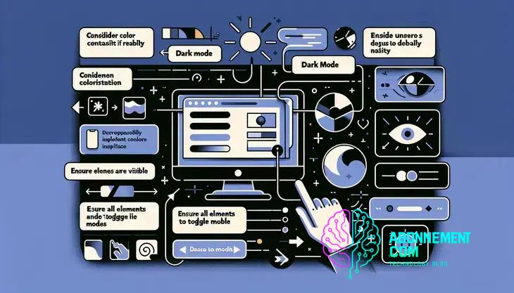
Designing accessible dark mode interfaces
Designing accessible dark mode interfaces is crucial for ensuring that all users can enjoy a good experience. One of the first considerations is contrast. High contrast between text and background is vital. Use light-colored text on dark backgrounds to maintain clarity. This helps those with vision impairments or color blindness navigate without trouble.
Another important aspect is the use of color. Avoid relying solely on color to convey information. For instance, instead of just using a color to show a button’s state, add text labels or icons. This way, users who may not see the color change will still understand the action required.
Implementing scalable text sizes is also essential. Make sure that users can adjust text sizes without losing the layout or readability of the interface. Allow for text scaling to ensure comfortable reading for everyone, including those with visual difficulties.
Consider including user settings for dark mode activation. Users should have the option to choose their preferred mode based on their environment. Providing control not only enhances user experience but also meets individual needs.
Finally, always test designs with real users, including those with disabilities. Their feedback can lead to improvements that ensure the dark mode interface is not just stylish, but also functional and accessible for everyone.
Best practices for implementing dark mode
Implementing dark mode effectively requires careful planning and attention to detail. One of the best practices is to ensure that the contrast ratio meets accessibility standards. Aim for a contrast ratio of at least 4.5:1 for normal text and 3:1 for large text to ensure that your content is clear and readable for all users.
Next, use color palettes wisely. Choose colors that are easy on the eyes and avoid excessive use of bright colors, which can be jarring against a dark background. Opt for soft colors for UI elements to create a balanced appearance.
It’s also important to provide user preferences. Allow users to toggle dark mode on and off easily. Consider remembering their choice through cookies or user settings so that it remains consistent across sessions.
Testing is crucial, especially on different devices and screen types. Test your dark mode design on both OLED and LCD screens, as colors can appear differently. Adjustments may be necessary to ensure the best visual experience across devices.
Another key point is to maintain functionality. Ensure that all interactive elements, like buttons and links, are still easily identifiable in dark mode. Using outlines or distinct hover effects can enhance usability.
Lastly, gather user feedback after implementing dark mode. This feedback can help you identify areas for improvement and refine the interface based on real user experiences.
Popular websites using dark mode
Many popular websites have adopted dark mode to enhance user experience and improve accessibility. Websites like YouTube provide users the option to switch between light and dark themes, allowing them to choose based on their environment or preference. This feature is especially beneficial during nighttime viewing, reducing eye strain.
Another notable example is Twitter. The platform’s dark mode not only looks modern but also helps users read content comfortably in low-light conditions. This accessibility feature has contributed to increased user satisfaction and engagement.
Additionally, Facebook has implemented dark mode on its desktop and mobile platforms. This design choice has received positive feedback from users who prefer a less bright interface, especially when browsing for extended periods.
Web design applications like Adobe Photoshop and Figma also offer dark mode. Designers can work for longer hours without experiencing visual fatigue, making the creative process more enjoyable.
By aligning with modern design trends, these websites illustrate the growing acceptance of dark mode as a standard feature. As more users prefer this aesthetic, adopting dark mode can help websites attract and retain visitors.
Tools for creating dark mode designs
When it comes to creating dark mode designs, several tools can help streamline the process and enhance creativity. One popular option is Figma. This design tool allows users to create interfaces and mockups with dark mode features easily. Figma’s collaborative environment enables real-time feedback, making it a great choice for teams.
Another excellent tool is Adobe XD. This software provides designers with the ability to prototype apps and websites. It offers features focused on dark mode, such as color adjustments and design systems that help maintain consistency across screens.
Sketch is also widely used in the industry. It allows designers to create adaptable layouts that work well in both light and dark themes. With its extensive plugin library, users can implement various dark mode features efficiently.
For developers, VS Code provides great support for dark themes. This code editor helps developers build responsive designs and interfaces. It offers theme customization options, allowing developers to create a dark mode that fits their project’s needs.
Additionally, CSS frameworks, like Bootstrap and Tailwind CSS, have built-in support for dark mode. These frameworks make it easier for developers to implement dark themes across their applications with minimal effort.
Using these tools effectively can ensure that designers and developers create appealing and user-friendly dark mode interfaces.
Future trends in dark mode
The future of dark mode is promising and continues to evolve with user preferences and technological advancements. One key trend is the widespread adoption of dark mode across various platforms. More applications, websites, and operating systems are integrating dark mode as a default option, responding to growing user demand for more comfortable viewing experiences.
Another trend is the focus on customization. Users are increasingly looking for the ability to customize their dark mode settings. This includes adjusting color schemes, brightness, and even font styles to fit personal preferences. Companies are noticing that providing options enhances user satisfaction and engagement.
Artificial intelligence is set to play a larger role in optimizing dark mode experiences. By using AI, apps can analyze user behavior and automatically switch between light and dark modes based on the surrounding light conditions or individual user habits. This dynamic adjustment can improve usability and comfort.
Designers are also exploring enhanced graphics and animations that work well in dark mode. Creating visually appealing user interfaces that maintain usability will become increasingly important. This includes thoughtful use of contrast, shadows, and color palettes that are both aesthetically pleasing and functional.
As user awareness grows regarding eye health, we can expect a shift toward darker color palettes not just for aesthetics but also for well-being. This awareness can fuel more innovations in dark mode implementations, focusing on reducing eye strain in various lighting environments.
Common challenges in dark mode development
When developing dark mode, there are several common challenges that designers and developers face. One major issue is ensuring proper contrast. While dark backgrounds can reduce eye strain, if text and essential elements are not contrasted well, users may struggle to read content or navigate the interface. It’s crucial to test color combinations to achieve optimal readability.
Another challenge is maintaining visual consistency across different elements. This includes ensuring that icons, buttons, and text are all suitable for dark backgrounds. A design that looks good in light mode may not translate effectively when switched to dark mode, requiring careful adjustments.
Accessibility is also a significant concern. Designers must consider users with visual impairments who may rely on high contrast. Implementing dark mode should not compromise the usability of the interface for these users, so continued accessibility testing is essential.
Additionally, implementing dynamic themes can be complicated. Allowing users to switch between light and dark modes in real-time requires additional coding and design thought to ensure that all elements adjust smoothly without crashing or lagging.
Finally, user preferences can vary widely. Some users may prefer darker backgrounds with certain colors, while others might want a different aesthetic altogether. Finding a balance that satisfies a broad audience while offering customization options can be a difficult task.
In summary, embracing dark mode in design
Dark mode has become a popular feature that many users appreciate. It not only enhances visual comfort but also helps reduce eye strain, especially in low-light settings.
However, creating an effective dark mode comes with challenges, such as ensuring proper contrast and maintaining accessibility. Developers and designers must navigate these issues to provide the best user experience.
As technology continues to advance, the future of dark mode looks bright. More websites and applications will likely adopt this feature, along with improvements and customization options to meet user needs.
By focusing on user preferences and addressing common design challenges, we can create interfaces that are enjoyable and accessible for everyone.


