
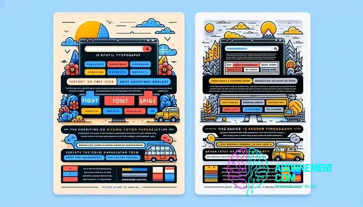
The Role of Typography in Web Design
Web typography guide is essential for improving user experience and engagement. Discover actionable tips to optimize your design today.
Web typography is essential for crafting visually appealing and readable designs, emphasizing the importance of font selection, hierarchy, contrast, and whitespace to enhance user experience and engagement across various devices.
Web typography guide is crucial for anyone looking to enhance their online presence. Have you ever noticed how a well-chosen font can transform your website’s feel? In this guide, we’ll explore key strategies to improve your typography and boost user engagement.
Understanding the basics of web typography
Understanding the basics of web typography is essential for creating visually appealing and easy-to-read websites. Typography is not just about selecting fonts; it involves understanding how to effectively use these fonts within a design.
What is Web Typography?
Web typography refers to the way text is displayed on websites. This includes the choice of fonts, the size of the text, spacing, and alignment. Good typography enhances user experience by making content more readable and engaging.
Key Elements of Web Typography
There are several key elements to consider when working with web typography:
- Font Selection: Choose fonts that match your website’s purpose and tone. Serif fonts can convey tradition, while sans-serif fonts often appear more modern.
- Font Size: Ensure that your font size is legible across devices. A good starting point is around 16px for body text.
- Line Length: Keep line lengths between 50-75 characters for optimal readability, as longer lines can compromise user experience.
- Line Height: This should be 1.5 times the font size to create enough space between lines and improve readability.
- Contrast: Ensure there’s a strong contrast between the text color and background to make reading easier.
By understanding these core principles, you can create a strong foundation for effective web typography.
Importance of font selection in web design
The importance of font selection in web design cannot be overstated. The right fonts can establish the character of your brand and enhance the overall user experience.
Why Font Selection Matters
Fonts do more than just convey text; they communicate feelings and brand identity. Different fonts evoke different emotions. For instance, a playful font can create a friendly atmosphere, while a serif font might convey trust and professionalism.
Choosing the Right Fonts
Here are some tips to help you select the right fonts for your website:
- Understand Your Audience: Consider who will be visiting your site. Tailor your font choices to their preferences and expectations.
- Match the Tone: Make sure your fonts align with your website’s overall message. A tech blog may benefit from modern sans-serif fonts, while a law firm might choose elegant serif fonts.
- Limit Your Selections: Use no more than two to three different fonts on your site to maintain consistency and avoid a cluttered look.
- Test for Readability: Ensure your fonts are easy to read on all devices and at various sizes. A good contrast between text and background is crucial.
By carefully selecting fonts, you can effectively communicate your brand’s message and improve the user experience.
How to choose the right font pairings
Choosing the right font pairings is crucial for creating a harmonious and effective web design. Good font combinations can enhance readability and aesthetic appeal.
Understanding Font Pairing
Font pairing involves selecting two or more fonts that complement each other when used together. This can create visual interest and guide the reader’s eye through the content.
Tips for Choosing Font Pairings
- Contrast is Key: Pair fonts with contrasting styles. For example, combine a bold sans-serif with a delicate serif font to create an engaging look.
- Stay Within a Family: Using different weights (bold, regular, light) or styles (italic, normal) from the same font family can maintain consistency while adding variety.
- Limit Your Pairings: Use no more than two or three fonts in a design to avoid confusion. Too many fonts can make the design look chaotic.
- Consider Hierarchy: Use different font sizes and styles to establish a hierarchy. For headings, choose a stronger font to draw attention, while keeping body text simple.
- Test Readability: Always check how your font pairs look on different devices. Ensure they are easily readable in various sizes and screen types.
By following these guidelines, you can create attractive and effective font pairings that enhance your web design.
Best practices for font sizes and hierarchy
Using the right font sizes and hierarchy is essential to ensure that your web content is readable and visually appealing. Properly structured text guides readers through your content effortlessly.
Importance of Font Sizes
Font size affects readability. A general rule is to use larger sizes for headings and smaller sizes for body text. For most websites, start with:
- Headings: Use sizes between 24px and 36px for main headings, depending on your design.
- Subheadings: Sizes around 18px to 24px work well to differentiate sections.
- Body Text: A size of 16px is often the standard for comfortable reading on most devices.
Establishing a Visual Hierarchy
A clear visual hierarchy helps communicate the importance of different elements on your page. Here are some key points:
- Use Different Weights: Combine bold and regular font weights to emphasize section titles or important phrases.
- Incorporate Color: Different colors can help highlight certain text, but ensure they maintain good contrast with the background.
- Spacing Matters: Use adequate line spacing (1.5 to 1.6 times the font size) to provide clarity between lines of text.
By implementing these best practices, you can create a visually organized and engaging web experience for your readers.
Creating contrast for readability
Creating contrast for readability is vital in web design. Good contrast helps users easily read the text and engage with the content on your site.
Understanding Contrast
Contrast refers to the difference between text and background colors. High contrast improves legibility. For example, dark text on a light background is easier to read than light text on a light background.
Best Practices for Using Contrast
- Choose Contrasting Colors: Use color combinations like black and white or navy blue and light yellow to ensure text stands out.
- Test Accessibility: Assess color combinations using online tools that simulate how visually impaired users see your site.
- Avoid Overuse of Bright Colors: While bright colors can attract attention, using them for all text can be overwhelming. Reserve them for emphasis.
- Consider Font Weight: Use bold typefaces for headings to create additional contrast against regular body text, further aiding readability.
Implementing Contrast in Web Design
When designing, always preview your text against backgrounds. This can help you identify areas that need more contrast. A clean and clear design improves user experience and keeps visitors engaged.
Responsive typography for various devices
Responsive typography is essential for ensuring that text looks great on all devices, from desktops to smartphones. This helps maintain readability and user experience across different screen sizes.
Why Responsive Typography Matters
With users accessing websites on various devices, it’s important to ensure that your fonts adjust to fit different screen sizes. Poorly formatted text can lead to frustration and increased bounce rates.
Key Techniques for Responsive Typography
- Use Relative Units: Instead of fixed sizes (like pixels), use relative units such as ems or rems. This allows text to resize based on user preferences or screen dimensions.
- Media Queries: Implement CSS media queries to adjust font sizes at different breakpoints. For example, increase font sizes on larger screens for better visibility.
- Fluid Typography: Consider using the CSS functions like
clamp()to create fluid typography that scales smoothly between minimum and maximum sizes based on the viewport. - Hierarchy and Readability: Maintain a clear hierarchy by adjusting heading sizes relative to body text. This ensures a consistent flow of information across platforms.
Testing Your Typography
Always test your typography on multiple devices to ensure readability and design integrity. Use browser developer tools to simulate different screen sizes and make adjustments accordingly.
The role of whitespace in typography
The role of whitespace in typography is crucial for creating an effective and visually appealing layout. Whitespace, also known as negative space, refers to the areas around and between elements in a design.
Enhancing Readability
Whitespace improves readability by preventing text from feeling cramped. Generous spacing around text blocks makes it easier for readers to focus on the content, reducing eye strain. Aim for sufficient margins, padding, and line spacing.
Creating Visual Balance
A well-balanced layout uses whitespace to guide the reader’s eye. It creates a clear visual structure, allowing elements to breathe and making the overall design feel harmonious. Avoid cluttered designs that overwhelm users.
Highlighting Important Elements
Whitespace can draw attention to key information, such as headings or calls-to-action. By surrounding these elements with adequate space, you help them stand out, making the message more impactful.
Improving User Experience
Incorporating whitespace into your typography enhances the overall user experience. A clean and spacious design encourages users to engage with your content and explore your website further.
Common typography mistakes to avoid
When designing with typography, avoiding common mistakes is essential for effective communication. Here are several frequent typography errors to watch out for:
1. Using Too Many Fonts
One of the biggest mistakes is using too many different fonts. This can make the design look chaotic. Stick to two or three fonts throughout your website to maintain consistency.
2. Ignoring Font Size
Choosing the wrong font size can lead to readability issues. Ensure body text is at least 16px for comfortable reading and use larger sizes for headings and important information.
3. Bad Line Spacing
Not giving enough line spacing can make text feel cramped. Use a line height of 1.5 to 1.6 times the font size to enhance readability.
4. Poor Contrast
Low contrast between text and background can make content hard to read. Always ensure there is enough contrast; black text on a white background is a classic choice.
5. Overuse of All Caps
Using all capital letters for body text can be hard to read. Reserve this style for headings or special emphasis, as it can interrupt the flow of reading.
6. Neglecting Hierarchy
Failing to establish a clear visual hierarchy can confuse readers. Use different weights and sizes for headings, subheadings, and body text to guide users through your content.
7. Forgetting to Test
Always test your typography across different devices and screen sizes. What looks good on a desktop may not work well on a mobile device, so check for readability and style on each platform.
Resources for further learning and inspiration
Expanding your knowledge about typography can greatly enhance your design skills. Here are some valuable resources for further learning and inspiration to help you grow:
1. Online Courses
Websites like Coursera and Udemy offer various courses on typography. These courses cover the fundamentals and advanced techniques, allowing you to learn at your own pace.
2. Books
Consider reading books such as “The Elements of Typographic Style” by Robert Bringhurst or “Thinking with Type” by Ellen Lupton. These texts provide in-depth insights into typography principles and design.
3. Design Blogs
Follow design blogs like Smashing Magazine and Typewolf. These platforms offer articles, tutorials, and updates on typography trends.
4. Typography Generators
Experiment with typography using online tools like Google Fonts and Adobe Fonts. These resources allow you to explore various font pairings and styles to see what works best.
5. Inspiration Galleries
Websites like Behance and Dribbble showcase design projects from creatives around the world. Browsing these galleries can inspire you and offer fresh ideas for your typography projects.
6. Webinars and Workshops
Participate in webinars and workshops conducted by typography experts. Platforms like Eventbrite often list events focusing on typography and design.
By utilizing these resources, you can deepen your understanding of typography and stay updated on the latest design trends.
In conclusion: mastering web typography
Mastering web typography is key to creating engaging and effective designs. By understanding the basics, selecting the right font pairings, and utilizing whitespace wisely, you can greatly improve user experience.
Avoid common mistakes such as using too many fonts or ignoring contrast, and focus on responsive typography that works well on all devices.
Finally, keep learning and drawing inspiration from available resources. Good typography is an ongoing journey, and staying updated on trends and best practices will set you apart. Your designs can shine with the right typography choices!


